Quiet Luxury, Tangible Warmth
Undertones That Soothe
Notice whether taupe leans rosy, green, or violet; those whispers affect harmony across fabrics and wood tones. Sample on large boards, move them around the room, and observe morning through evening. Calm emerges when undertones echo each other like soft chords, never clashing, always resolving gracefully.
Balancing Light and Shadow
Use lighter values to lift ceilings and deeper values to ground furniture, letting shadows sketch architecture instead of heavy color. Diffused light loves matte finishes; glossy sheens amplify glare. Balance reflectance so your eyes relax, reading texture before tone, finding focus where comfort naturally gathers.
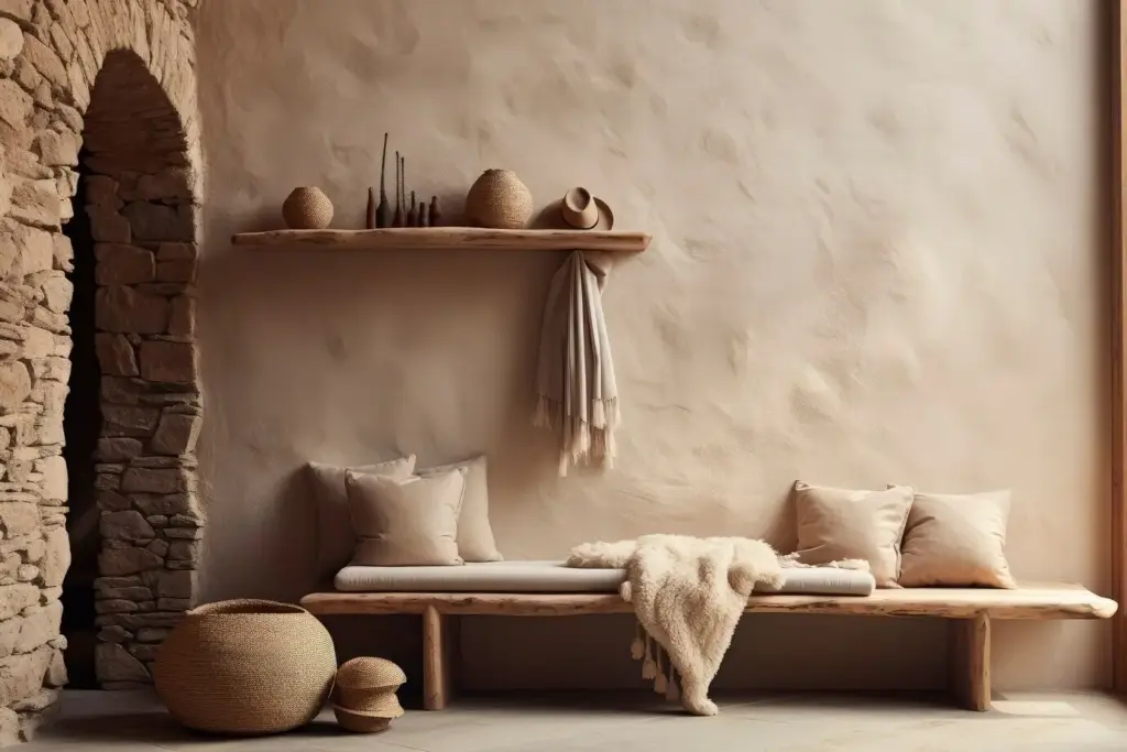
A Restful Reading Nook
I layered a low, linen chaise, a wool throw, and a plaster sconce beside books with rough fore-edges. The palette stayed hushed, yet the nook felt vivid because every surface invited touch. Guests lowered their voices, then lingered, breathing slower without realizing why.
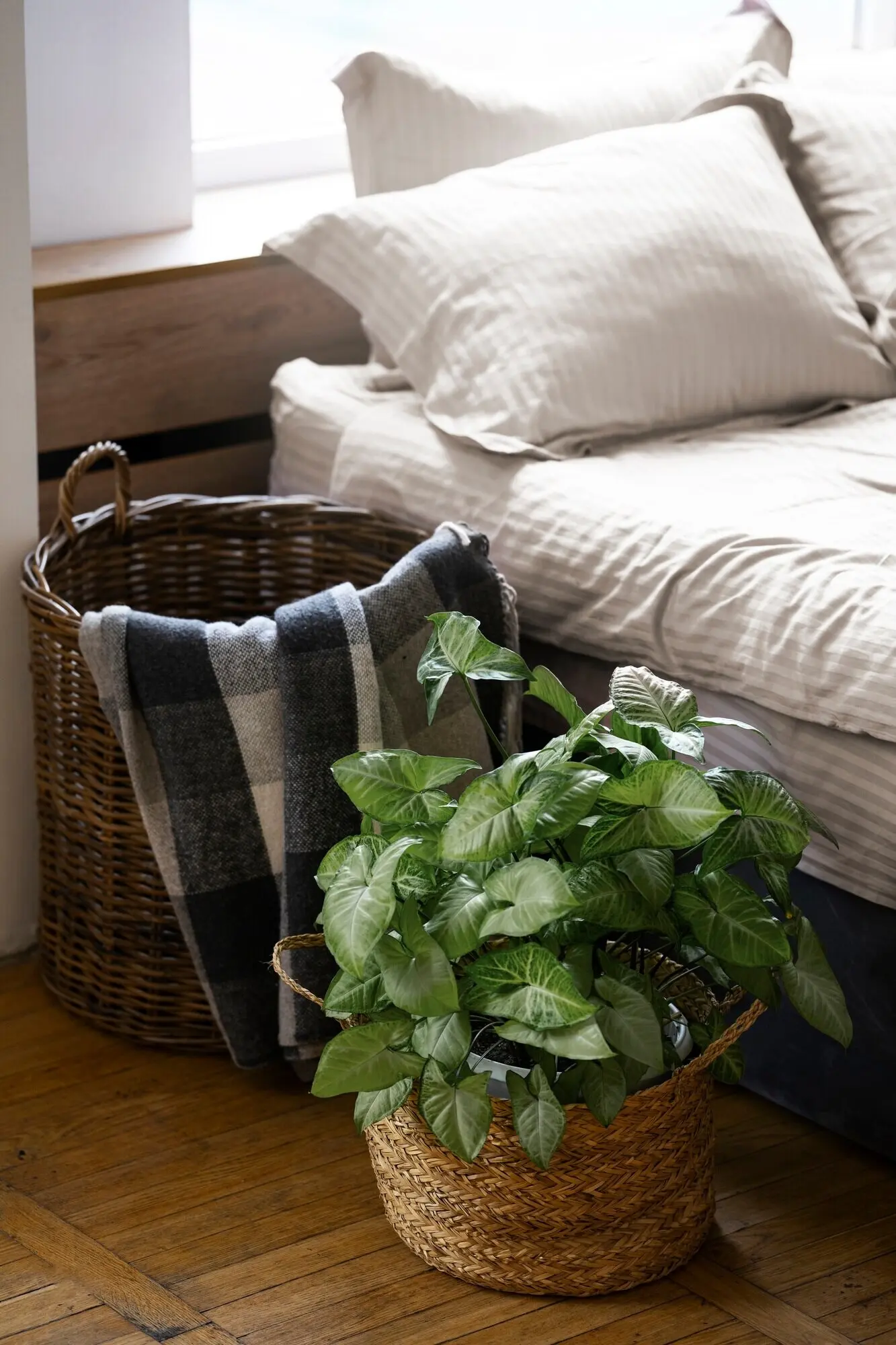
Texture as the New Ornament

Soft Layers
Hard Surfaces With Soul
The Hand-Touch Test
Composing a Cohesive Palette
Start With a Grounding Base
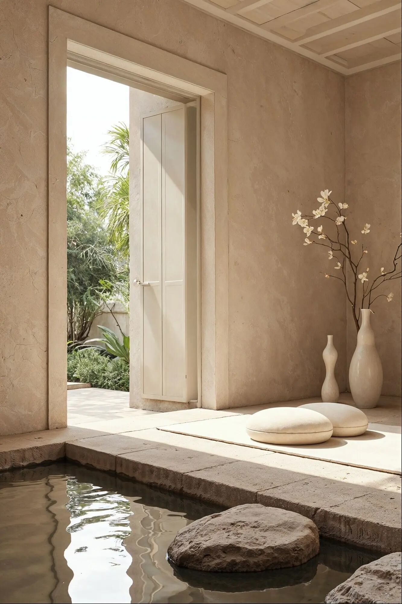
Choose the largest plane—usually walls or a big rug—to carry your calmest neutral. Test multiple candidates side by side, half in shade, half in sun. The winner should soften edges, flatter skin, and make wood grains glow without stealing attention from cherished objects.
Introduce Subtle Contrast
Bring in a slightly deeper or lighter companion that shifts temperature subtly. Contrast should feel like a sigh, not a gasp. Use it to frame door casings, window mullions, or plinths, where shadow joins craftsmanship and the eye settles into a calming rhythm.
Light, Sheen, and Atmosphere
Sustainable, Sensory Materials
Styling, Care, and Longevity


All Rights Reserved.